MiMascota - Pet Care App
Mi Mascota is a mobile app designed to give pet owners in Argentina one place for everything their pets need — profiles and medical records, a task calendar, a service finder for nearby vets and groomers, and offline care guides. It was my final diploma project, and my first time carrying a design through the full process end to end: research, MVP scoping, prototyping, and usability testing.
Introduction
Table of contents
Details
Design Challenge
Pet owners in Argentina manage their animals' health information the way people did decades ago — in paper health booklets, scattered across vets, groomers, and emergency contacts they can never find when they actually need them. When you travel with a pet, move cities, or have an unexpected vet visit, that fragmented information becomes a real problem.

How might we give pet owners a single, reliable place to manage their pets' health and care — one that works even without a paper trail or an internet connection?
Research & Discovery
Research started with surveys and interviews with pet owners, looking for patterns in how they actually managed their animals' information day to day. We interviewed four people that had different types of pets, different routines, and different needs when taking care of their pets.
The picture that emerged was consistent across respondents:
People relied on paper documents that were easy to lose or forget to bring
There was no reliable way to find trusted vets or groomers, especially in a new area
Owners struggled to keep track of recurring tasks — vaccinations, grooming, medication — especially across multiple pets
User Persona

Juana, 27 — Retail worker
"I don't want to be searching through folders when the vet is asking me what shots my dog has."
Who they are: Navigating a move between cities with a dog and a new cat
Goal: Wants her pets' health information and care tasks organized in one place she can access anywhere — not tied to a specific vet's office or a folder she might not have packed
Frustration: Paper records don't travel well, and finding trustworthy vets/groomers in a new city means starting from zero
What they need from this app: Centralized medical records she can access and share instantly, a way to find vetted local services, and reminders that don't depend on her remembering everything herself
Plan
The MVP was scoped around four core features, each solving a distinct part of the problem surfaced in research:
Pet profiles — centralize medical records, documents, and emergency contacts in one shareable place, eliminating the paper booklet entirely
Service finder — locate nearby vets, groomers, and other professionals with ratings, reviews, and contact details
Calendar — handles tasks and reminders per pet, with alarms, so recurring care doesn't rely on memory
Guides — offline reference content organized by species and topic, so owners can find answers without an internet connection or a vet visit
Scoping to these four — and deliberately leaving Community out of this MVP iteration — kept the project focused enough that usability testing could actually validate something real, rather than testing a half-built version of everything at once.
Information Architecture
The app follows a five-tab structure, each with a clear, distinct purpose:
Home/Profile — pet profiles and their medical records
Services — the vet/groomer finder
Calendar — tasks and reminders
Community — where people can ask,comment, or interact with other pet owners (scoped in the IA but not fully designed in this iteration)
Guides — offline species/topic reference content

Design System
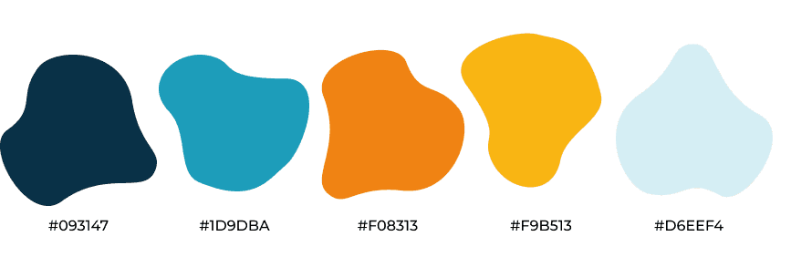
Mi Mascota needed to feel trustworthy enough to hold real medical records, but warm enough that checking in on your pet's care never felt like a chore. The navy carries that trust; the orange and yellow carry the warmth. Every visual choice was filtered through one question: does this feel like something a pet owner can rely on?
Color palette
Typography

Neulis Cursive Extra Bold / Italic — titles (a rounded, friendly display font, fitting for a pet-care product)
Montserrat (Medium / Semi Bold) — body text and UI
Components
The system was built out at the component level before screens, so consistency was baked in early rather than
patched later:

Top bar & nav bar
Keeps orientation clear as users move throughout the entire app.
Navigation shows the five core sections at a glance.
Dropdowns
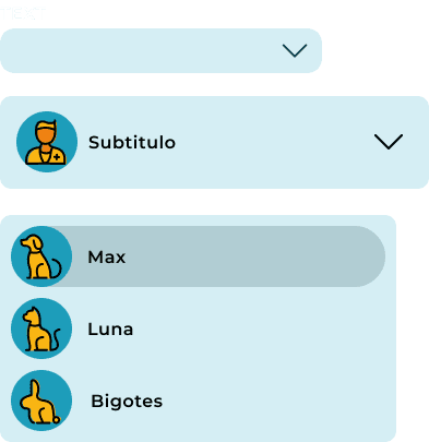
Used for filtering and pet selection — includes a pet-specific dropdown showing saved pets so switching context between pets stays fast.

Calendar
Full month view with task confirmation built in — designed to make scheduling and reminders feel as simple as checking a date off, not filling out a form.
Buttons & switches
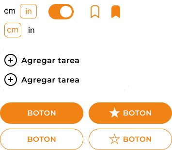
Primary and secondary button states, toggle switches, and unit switches (cm/in) — kept simple and high-contrast so key actions are always obvious.

Carousel cards
Surfaces provider name, contact info, and a save/bookmark action in one glanceable card, so comparing nearby vets doesn't require opening each one individually.

Icon set
A custom icon library spanning navigation, actions, and pet-specific icons (paw, bowl, grooming scissors, leash) — built to feel warm and a little playful rather than generic.

Logo: The "Mi Mascota" wordmark pairs with a paw/flame-style icon mark, shown across the full color range (navy, blue, orange, yellow) — giving flexibility for where it sits against different backgrounds in the app.
Prototypes

Detailed View
Testing
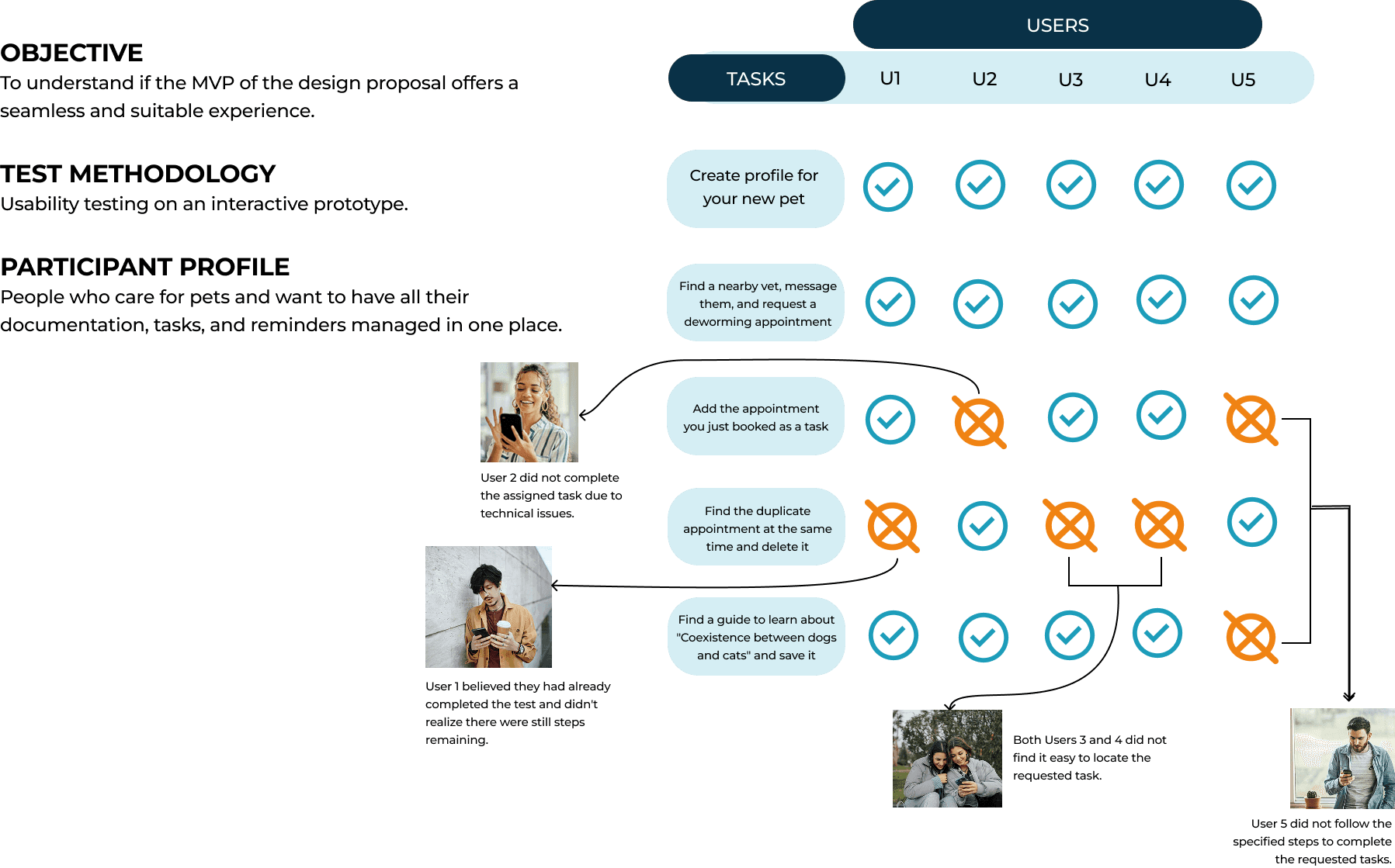
The prototype was tested with five users across six tasks, including creating a pet profile, finding a nearby vet, scheduling an appointment, and searching and saving a guide.
Most tasks were completed successfully across all users. The failures were specific and informative:
One user didn't realize there were still steps remaining after what felt like a completion point
Two users struggled to find the guide search function
Both issues pointed to the same underlying problem: moments where the interface implied completion before it was actually reached. Those findings directly informed the final iteration of the prototype.
Next Steps
The Community tab was defined in the IA but not fully designed in this iteration — it's the most meaningful gap. A space where pet owners can share experiences, ask questions, and connect with others who have the same breed or species could add real value to the app beyond the utility features.
I'd also want to run a second round of usability testing after the iteration, to validate whether the changes actually resolved the issues the first round surfaced. Testing once tells you what's broken. Testing twice tells you whether you fixed it.

thank you!
Check my other work!
A fresh reading experience that helps curious readers discover, track, and share the books they love.

Goodreads redesign
A guided workspace that helps teams make onboarding feel clear, calm, and connected from day one.

Onboarding Hub