Goodreads Redesign
Goodreads Redesign
Goodreads is the largest platform for readers in the world, but its app doesn't feel like it belongs to readers; it feels like a database with a login screen. I redesigned the mobile experience end-to-end: information architecture, visual identity, and a new set of engagement mechanics, with the goal of making the app something people actually want to open, not just tolerate.
Introduction
Table of contents
Details
Goodreads is the largest platform for readers in the world, but its app doesn't feel like it belongs to readers; it feels like a database with a login screen. I redesigned the mobile experience end-to-end: information architecture, visual identity, and a new set of engagement mechanics, with the goal of making the app something people actually want to open, not just tolerate.
Introduction
Table of contents
Details
Design Challenge
Design Challenge
Goodreads' interface is cluttered, its navigation is unclear, and features that should be central to the experience, book clubs (groups), reading challenges, are buried where most users never find them. The social layer technically exists, but it's invisible in practice. The result is an app that doesn't reflect the warmth reading actually brings to people's lives.
The goal of this redesign was simple: make the app worth using.
Goodreads’ interface is cluttered, its navigation is unclear, and features that should be central to the experience, book clubs (groups), reading challenges, are buried where most users never find them. The social layer technically exists, but it’s invisible in practice. The result is an app that doesn’t reflect the warmth reading actually brings to people’s lives.
The goal of this redesign was simple: make the app worth using.
How might we redesign Goodreads so its digital experience feels as rewarding as the act of reading itself?
How might we redesign Goodreads so its digital experience feels as rewarding as the act of reading itself?
Research & Discovery
Research & Discovery
The research for this project started with my own frustrations as a long-time Goodreads user. I mapped the exact moments the app lost me.
I then validated those frustrations through informal interviews with casual readers. (3 friends who read/write) Across those conversations, three themes came up consistently:
Discovery felt random: book recommendations didn't feel personal or intentional
Social features were invisible: people didn't know book clubs existed inside the app at all
Nothing made reading feel like something to look forward to: no sense of momentum or reward
The research for this project started with my own frustrations as a long-time Goodreads user. I mapped the exact moments the app lost me.
I then validated those frustrations through informal interviews with casual readers. (3 friends who read/write) Across those conversations, three themes came up consistently:
Discovery felt random: book recommendations didn’t feel personal or intentional
Social features were invisible: people didn’t know book clubs existed inside the app at all
Nothing made reading feel like something to look forward to: no sense of momentum or reward
User Persona
User Persona

Lucila, 24 — Student
"I feel like the apps out there are too confusing for me."
Lucila, 24 — Student
“I feel like the apps out there are too confusing for me.”
Who they are: Reads casually, 1-2 books a month, keeps track of books read in a Word file.
Goal: Wants to keep their track of books read in an easier way. Find new recommendations for books they might like.
Frustration: Isn't very tech-savvy. When she tried Goodreads, she got frustrated because she didn't understand what the app was for or how to use it.
What they need from this redesign: clear navigation, organized way to keep track of books they read, a discovery experience that feels curated rather than random
Who they are: Reads casually, 1-2 books a month, keeps track of books read in a Word file.
Goal: Wants to keep their track of books read in an easier way. Find new recommendations for books they might like.
Frustration: Isn’t very tech-savvy. When she tried Goodreads, she got frustrated because she didn’t understand what the app was for or how to use it.
What they need from this redesign: clear navigation, organized way to keep track of books they read, a discovery experience that feels curated rather than random
Plan
Plan
Given that the app's discovery felt random, social features were invisible, and the app gave readers no reason to return daily, I made two core decisions early on:
Given that the app's discovery felt random, social features were invisible, and the app gave readers no reason to return daily, I made two core decisions early on:
Restructure the navigation entirely rather than patch the existing one, so every feature has a clear, distinct home.
Build a visual and emotional language around the actual feeling of reading; since the current app strips that feeling out entirely.
Restructure the navigation entirely rather than patch the existing one, so every feature has a clear, distinct home.
Build a visual and emotional language around the actual feeling of reading; since the current app strips that feeling out entirely.
Those two decisions shaped everything downstream: the information architecture, the design system, and a set of engagement mechanics designed to answer one question: does this make you want to come back tomorrow?
Those two decisions shaped everything downstream: the information architecture, the design system, and a set of engagement mechanics designed to answer one question: does this make you want to come back tomorrow?
Engagement Mechanics
Engagement Mechanics
A reading app lives or dies on the question above, and Goodreads doesn't have a strong answer. I built four interlocking mechanics to change that:
Daily streak (inspired by Duolingo): a simple, low-friction motivation loop
Challenge cards designed like collectible paper-cut bookmarks: worth finishing the set for
For You swipe: turns discovery into an active choice instead of a passive scroll
Stats & badges: turn reading history into something to feel proud of and build on
These aren't four separate features, they're one loop: streaks build momentum, challenges give momentum a goal, discovery feeds the challenge, and stats reflect it all back to the reader.
A reading app lives or dies on that question, and Goodreads doesn’t have a strong answer. I built four interlocking mechanics to change that:
Daily streak (inspired by Duolingo): a simple, low-friction motivation loop
Challenge cards designed like collectible paper-cut bookmarks: worth finishing the set for
For You swipe: turns discovery into an active choice instead of a passive scroll
Stats & badges: turn reading history into something to feel proud of and build on
These aren’t four separate features, they’re one loop: streaks build momentum, challenges give momentum a goal, discovery feeds the challenge, and stats reflect it all back to the reader.

Information Architecture
Information Architecture
The most structural problem with the original Goodreads app is its navigation; features are buried, unrelated things share the same space, and there's no clear mental model for where anything lives.
My redesign gives every feature a distinct home across five tabs:
Home: your daily reading life
Library: your personal space
Discover: finding what to read next
Community: the social layer that always existed but was never visible, including Book Clubs, finally named something that makes sense
Profile: your reading identity, not just a settings page
The most structural problem with the original Goodreads app is its navigation; features are buried, unrelated things share the same space, and there’s no clear mental model for where anything lives.
My redesign gives every feature a distinct home across five tabs:
Home: your daily reading life
Library: your personal space
Discover: finding what to read next
Community: the social layer that always existed but was never visible, including Book Clubs, finally named something that makes sense
Profile: your reading identity, not just a settings page

Design System
Design System
The most deliberate decision in this project wasn't a feature, it was a feeling. Reading is sensory: warm paper, a quiet afternoon, the weight of a book in your hands. That feeling is completely absent from the current Goodreads app, and bringing it forward digitally was the goal behind every visual choice.
The most deliberate decision in this project wasn’t a feature, it was a feeling. Reading is sensory: warm paper, a quiet afternoon, the weight of a book in your hands. That feeling is completely absent from the current Goodreads app, and bringing it forward digitally was the goal behind every visual choice.
Color palette
Color palette

Typography
Typography

The serif/sans pairing does real work here: Lora gives the app a literary, book-like warmth in titles and section headers, while Plus Jakarta Sans keeps the interface itself legible and unfussy; so the app feels like a reading space, not a novelty.
The serif/sans pairing does real work here: Lora gives the app a literary, book-like warmth in titles and section headers, while Plus Jakarta Sans keeps the interface itself legible and unfussy; so the app feels like a reading space, not a novelty.
Components
Components
The system was built out at the component level before screens, so consistency was baked in early rather than
patched later:
The system was built out at the component level before screens, so consistency was baked in early rather than
patched later:

Challenge cards
3 states (in progress, % complete,
completed) using the accent color
to mark completion
Nav bar
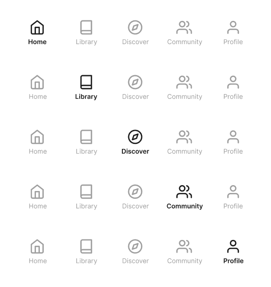
Five states shown (Home, Library, Discover, Community, Profile), each with a filled/active icon treatment

Book club preview
Surfaces member count, book of the month, and active discussions in one glanceable card

Streak card
Combines a weekly streak tracker with the current book and progress bar, anchored by a single clear CTA ("I've read today!")
Shelf spine sizes
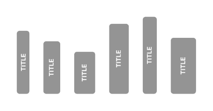
Variable-width book spines for the Library view, evoking a physical shelf rather than a flat list

Icons & badges
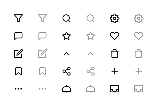
A consistent icon set and badge treatment (unlocked vs. locked) for the gamification layer

Illustration Paper-cut style illustrations (generated in Adobe Firefly) used on challenge cards — designed to feel like collectible bookmarks worth finishing the set for.
Illustration Paper-cut style illustrations (generated in Adobe Firefly) used on challenge cards — designed to feel like collectible bookmarks worth finishing the set for.
Every choice was filtered through one question:
does this feel like it belongs in a reader's life?
Every choice was filtered through one question:
does this feel like it belongs in a reader’s life?
Prototypes
Prototypes

Detailed View
Detailed View
HOME
LIBRARY
DISCOVER
COMMUNITY
PROFILE
BOOK DETAIL
CHALLENGE
LIBRARY
Organized into Currently Reading, Want to Read, Read, and Classics, with book spines replacing flat list rows — closer to browsing a real shelf than scanning a database.


Scroll
LIBRARY
Organized into Currently Reading, Want to Read, Read, and Classics, with book spines replacing flat list rows — closer to browsing a real shelf than scanning a database.
Scroll
Testing
Testing
This was a solo project with no formal user testing, a real limitation of the current version.
If I were to test this next, I'd prioritize:
5-second tests on the navigation to check whether the five tabs read intuitively without relying on labels
Task-based testing with casual readers (e.g. "find a book club," "start a reading challenge") to see whether the new IA actually resolves the original discoverability problem
Reactions to the engagement mechanics; do streaks and challenge cards read as motivating, or gimmicky?
This was a solo project with no formal user testing, a real limitation of the current version.
If I were to test this next, I’d prioritize:
5-second tests on the navigation to check whether the five tabs read intuitively without relying on labels
Task-based testing with casual readers (e.g. “find a book club,” “start a reading challenge”) to see whether the new IA actually resolves the original discoverability problem
Reactions to the engagement mechanics; do streaks and challenge cards read as motivating, or gimmicky?
Next Steps
Next Steps
With more time, I'd prioritize user testing with casual readers to validate whether the navigation and engagement mechanics land as intended. I'd expand the prototype so every interaction has a real destination, and design the flows I didn't get to: onboarding, the full book club experience, and other users' profiles.
I'd also design the micro-interactions that make an app feel alive, the streak confirming with a tap, the For You card swiping off screen, badges animating when unlocked. A warm, paper-inspired dark mode feels like a natural extension of everything this redesign is trying to be.
With more time, I’d prioritize user testing with casual readers to validate whether the navigation and engagement mechanics land as intended. I’d expand the prototype so every interaction has a real destination, and design the flows I didn’t get to: onboarding, the full book club experience, and other users’ profiles.
I’d also design the micro-interactions that make an app feel alive, the streak confirming with a tap, the For You card swiping off screen, badges animating when unlocked. A warm, paper-inspired dark mode feels like a natural extension of everything this redesign is trying to be.

thank you!
thank you!
Check my other work!
A friendly digital companion designed to help pet parents keep daily care simple, connected, and joyful.

MiMascota
A friendly digital companion designed to help pet parents keep daily care simple, connected, and joyful.
MiMascota
A guided workspace that helps teams make onboarding feel clear, calm, and connected from day one.

Onboarding Hub
A guided workspace that helps teams make onboarding feel clear, calm, and connected from day one.
Onboarding Hub