A mobile app designed to help pet owners manage their pet's health, appointments and daily care — developed through a full UX process from research and testing to high fidelity screens.
Mobile App
UX Case Study
Role
UX UI Designer
Timeline
8 weeks
team
2 UX UI Designers + Me
platform
Mobile

The Problem
Pet owners in Argentina manage their animals' health information the same way people did decades ago — in paper health booklets, scattered across vets, groomers, and emergency contacts they can never find when they need them. When you travel with a pet, move cities, or have an unexpected vet visit, that fragmented information becomes a real problem.
Mi Mascota is a mobile app designed to give pet owners one place for everything: their pets' profiles and medical records, a calendar for tasks and reminders, a service finder for nearby vets and groomers, and offline guides for care and behavior by species. Designed as my final diploma project, following a full design thinking process from research to usability testing.
Research + User Insights
Research started with surveys and interviews with pet owners, looking for patterns in how they actually managed their animals' information day to day. The picture that emerged was consistent: people relied on paper documents that were easy to lose, had no reliable way to find trusted vets in new areas, and struggled to keep track of recurring tasks like vaccinations, grooming, and medication across multiple pets.
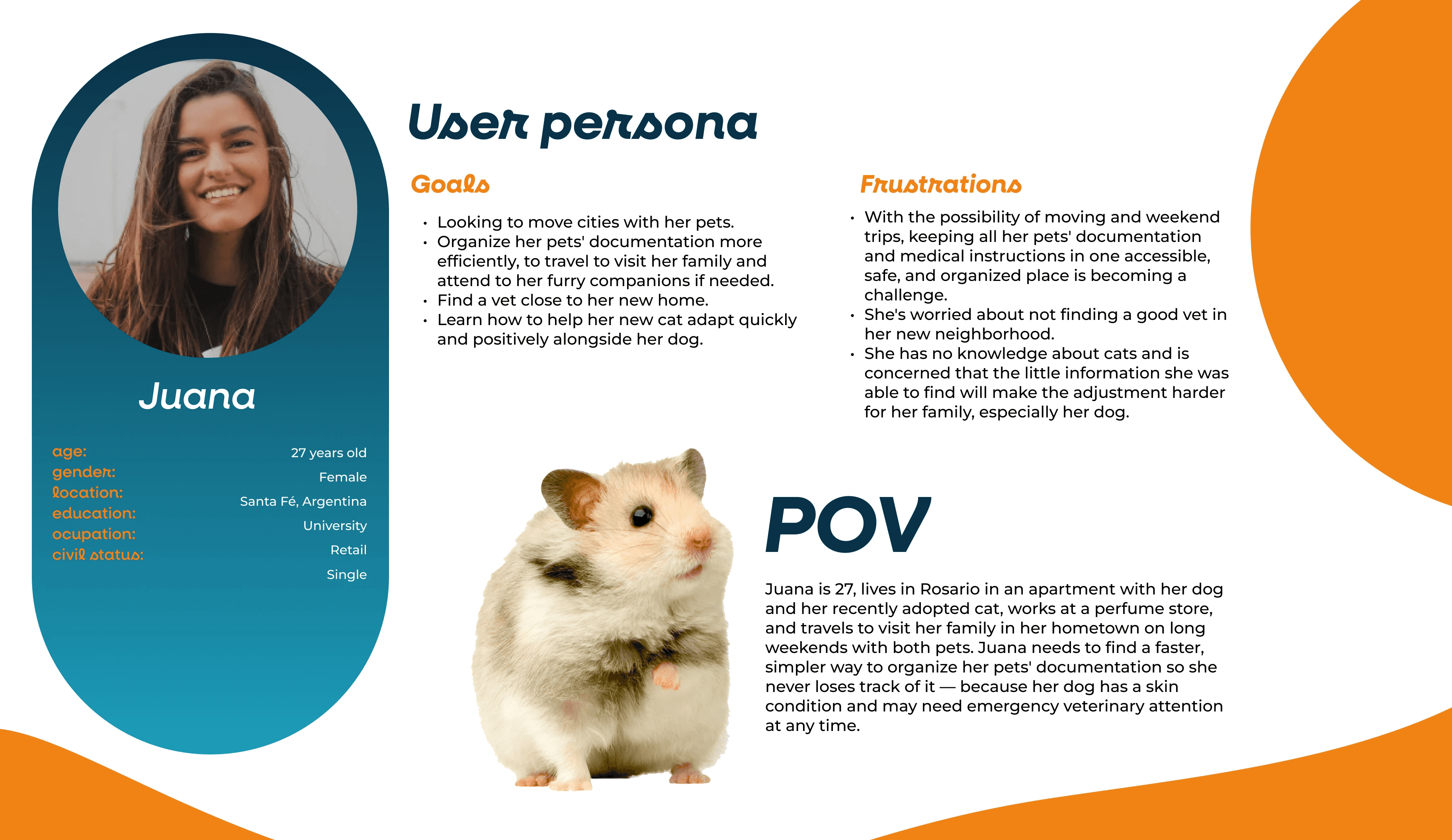
The user persona — Juana, 27, a pet owner navigating a move between cities with a dog and a new cat — grounded every subsequent decision. Her frustrations weren't edge cases. They were the norm.

Design Decisions
The MVP was scoped around four core features, each solving a distinct part of the problem. Pet profiles centralize medical records, documents, and emergency contacts in one shareable place — eliminating the paper booklet entirely. The service finder lets users locate nearby vets, groomers, and other professionals with ratings, reviews, and contact details. The calendar handles tasks and reminders per pet, with alarms. And the guides section provides offline reference content organized by species and topic — so owners can find answers without an internet connection or a vet visit.
The navigation follows a five-tab structure: Home/Profile, Services, Calendar, Community, and Guides — each with a clear, distinct purpose.

Usability Testing
The prototype was tested with five users across six tasks — creating a pet profile, finding a nearby vet, scheduling an appointment, searching a guide, and saving it. Most tasks were completed successfully across all users. The failures were specific and informative: one user didn't realize there were still steps remaining after what felt like a completion point, and two users struggled to find the guide search function.
Both issues pointed to the same underlying problem — moments where the interface implied completion before it was actually reached. Those findings directly informed the final iteration of the prototype.

What I Learned
This was my first end-to-end UX project — from blank page to validated prototype. The most valuable part wasn't any single deliverable; it was learning to treat every design decision as a hypothesis rather than a conclusion. The usability testing made that tangible: assumptions I'd made confidently turned out to be the exact moments where users got stuck.
It also taught me that scoping is a design skill. Defining a clear MVP — and committing to it — kept the project focused and made the testing meaningful.
What I'd Do Next
The Community tab was defined in the IA but not fully designed in this iteration — it's the most meaningful gap. A space where pet owners can share experiences, ask questions, and connect with others who have the same breed or species could add real value to the app beyond the utility features.
I'd also want to run a second round of usability testing after the iteration, to validate whether the changes actually resolved the issues the first round surfaced. Testing once tells you what's broken. Testing twice tells you whether you fixed it.
